The Psychology Behind Effective Billboard Design
Billboards are one of the most visible forms of Outdoor Advertising (OOH) in Mexico, capturing the attention of millions of drivers, commuters, and pedestrians daily. But what makes some billboards unforgettable while others fade into the background? The answer lies in psychology—how people process colors, fonts, and layouts in a matter of seconds.
Understanding the psychology behind billboard design helps advertisers create campaigns that are not only seen but remembered.
The Power of Color Psychology
Colors are more than decoration—they evoke emotions, associations, and actions. In billboard design, they must align with both the brand message and the audience mindset.
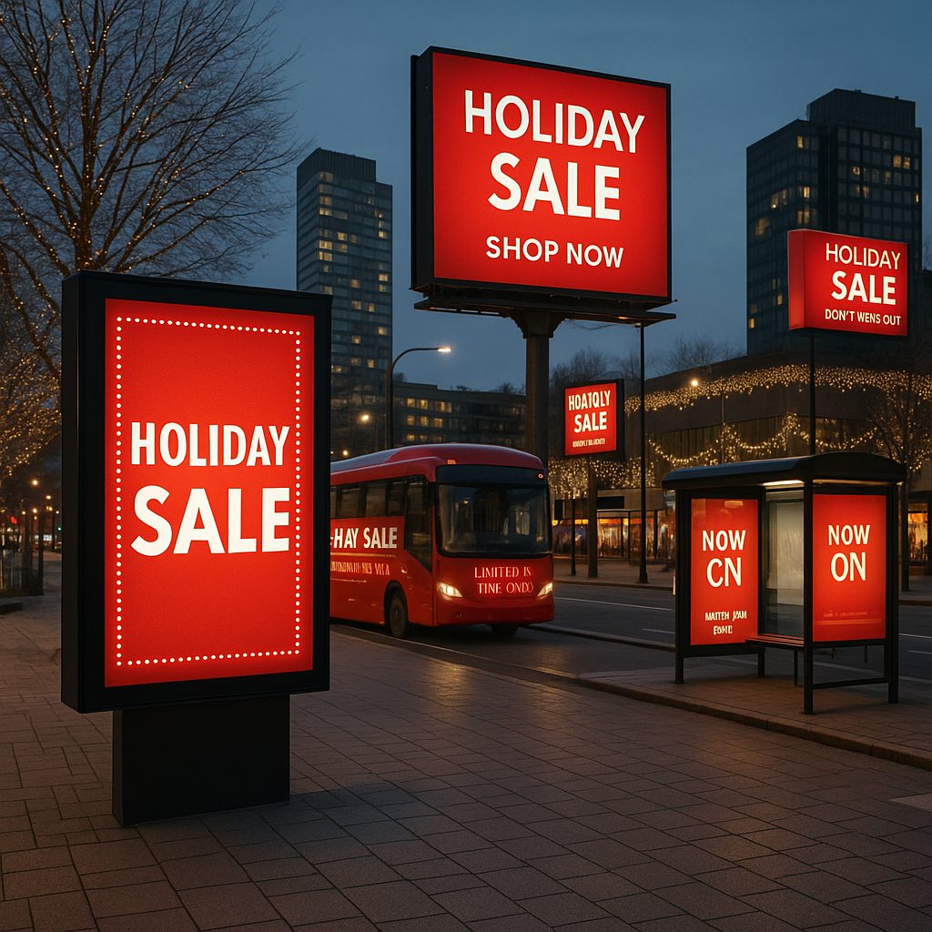
- Red → urgency, excitement, energy (common in food and retail ads).
- Blue → trust, professionalism, stability (ideal for banks, tech, corporate brands).
- Green → nature, health, calm (used in tourism, wellness, eco campaigns).
- Yellow → optimism and attention (great for grabbing focus in crowded areas).
👉 Example: A tourism campaign in Cancún using turquoise and green tones creates an immediate association with beaches and relaxation.
For deeper insights, see Color Psychology in Advertising – Verywell Mind.
Font Readability: Less is More
Fonts determine whether your message is readable in three seconds—the average time a driver glances at a billboard.
- Sans-serif fonts (e.g., Helvetica, Arial) are cleaner and easier to read from a distance.
- Bold, large letters ensure visibility on highways and urban avenues.
- Avoid cursive or decorative fonts, as they slow down reading speed.
📌 Rule of thumb: No more than 7 words in a headline. Brevity is clarity.
Emotional Triggers: Connecting Beyond Words
Billboards work best when they trigger emotions rather than overwhelm with information. Emotional psychology helps create stronger recall:
- Happiness & humor → memorable (beverage, entertainment).
- FOMO → limited-time offers, countdowns.
- Aspirational cues → lifestyles people want to achieve (real estate, luxury).
👉 In Mexico, campaigns for real estate developments often use aspirational imagery of families and modern living to connect emotionally with buyers.
Visual Hierarchy and Layout
A well-designed billboard guides the eye naturally. This is where visual hierarchy matters:
- Main image or icon → grabs immediate attention.
- Headline → delivers the key message in seconds.
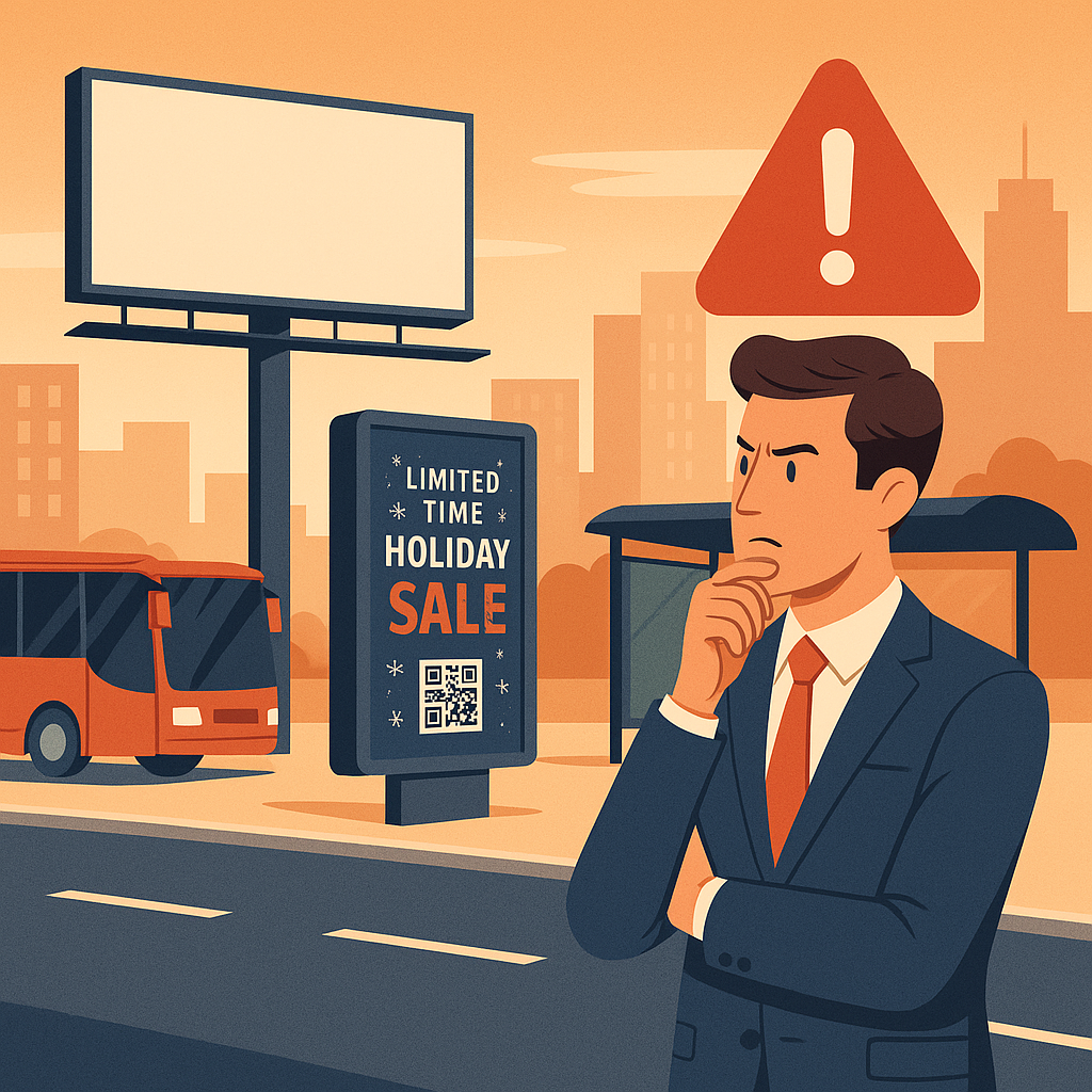
- Call to action → short and clear (website, QR code, phone).
Effective layouts follow the “3-second rule”: if someone can’t understand the ad in three seconds, the design fails.
For inspiration on OOH layouts, visit Ads of the World – Outdoor.
Key Takeaway
The psychology of billboard design is about blending art and science:
- Use colors that match emotions and brand identity.
- Choose fonts that maximize readability at high speeds.
- Leverage emotional triggers to connect beyond words.
- Apply visual hierarchy so the message is absorbed in 3 seconds.
📌 Bottom line: In Mexico’s competitive OOH landscape, billboards that apply psychological principles stand out, resonate with audiences, and deliver stronger ROI. 👉 Explore more on the BM Outdoor Blog and creative best practices via the OAAA and WOOH.
